How not to tell Shopify their button is rendering incorrectly
I have started to write a massive series of tech books. Basically, a from-almost-nothing-to-web-dev-with-Rails type series with everything a modern Rails dev is asked to know (Ruby, html, scss, sql, nosql, yaml, js, front-end frameworks etc etc).
I've started writing it but one thing I wanted to do was get a realistic picture of what famous Rails companies asked of their new employees.
Shopify is a famous Rails company, I thought. They are even mentioned on the Rails website alongside Basecamp so, a good bet for some of skills required.
This Software Dev position was typical of what I looked at.
Sadly, for my purposes not tons of the tech used or required but a worthy shot.
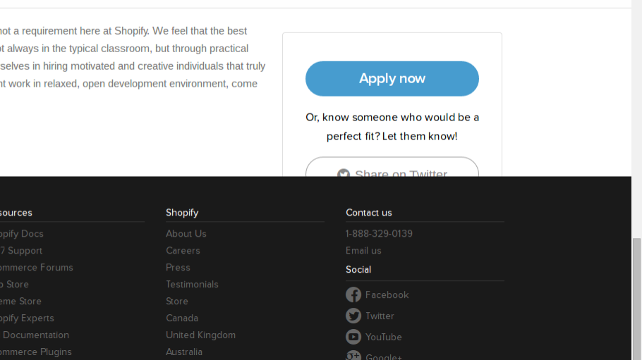
As I scrolled down however, TO MY HORROR!, a button that disappeared part behind the footer.

This seems to happen on every Shopify job posting I have been on as I scrolled right to the bottom of a job post. Was using Chrome. Not sure about other browsers.
Since early 2014 I've made a point of emailing/flagging up issues to companies (big or small). Doubly so if I pay for a product. I'm not a customer of Shopify but, they'd be more than happy to get a minor error flagged up?
Let me email you
I took a screenshot and the URL and looked for a way to email the team. Found an "email us" button in their footer, pressed that so that I could email the team.
Took me to a contact us page. Hmmmm.

Not exactly "email" us but the section on the left says something about email them. Another button down!
Drum roll…

Oh. Not at an email yet. Some commonly asked questions. Mostly about Shopify customer issues. Will to life intact but waning at this point.
Sidebar has yet another email us button. I'll press that. Third time the charm?

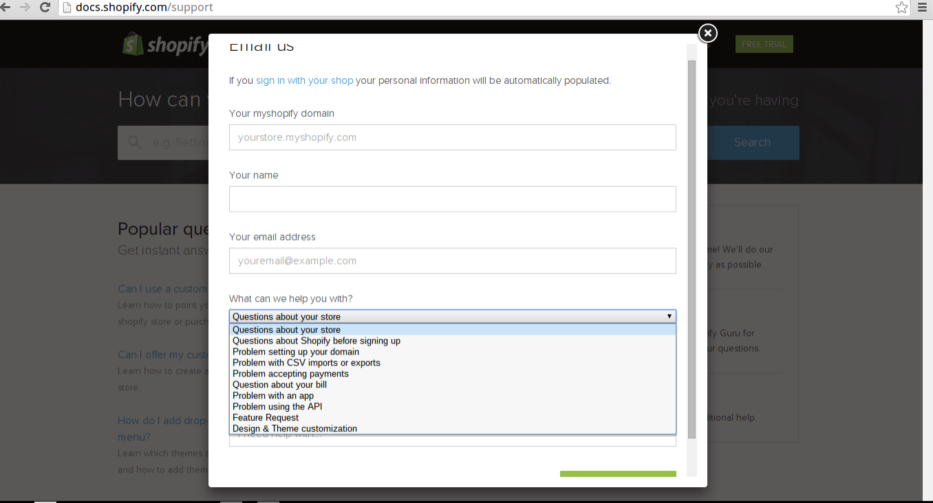
FINALLY A FORM! Before I got too excited, this form wasn't for me. Everything listed was for customers and nothing about emailing them a small error I found.
Maybe I should have just gamed the form and sent the stuff anyway. But I didn't. I gave up there. Went to twitter. A lot of companies that is the best bet. Should have tried it faster I thought to myself. I'll get the email that way!
Didn't happen.
They replied they were "sorry" to hear I had an issue. Not sure they were paying attention to my tweet honestly (not sure I was direct enough… Wanted an email so I could give them the picture and context). Asked for an email again, but more directly. Not heard back on that, don't think I will.
Undoubtedly most of the ways people contact Shopify would fit within that form but something to remember with a product is that sometimes the pain of letting people have your email is something you should deal with. And if you are going to state people can email you, let them do it. A contact form is not necessarily an email to a user or customer's point of view.
So, there it is. That is how you don't tell Shopify their button is broken.
A story worthy of telling your grandchildren is there ever was.